
Paint Color Predictions for 2024
It’s that time of the year again when all of the major paint manufacturers present their color forecast and announce their representative color for the upcoming year. Each paint company spends hours researching and observing the current cultural climate resulting in colors symbolic to it.

I’m excited for their trend predictions!
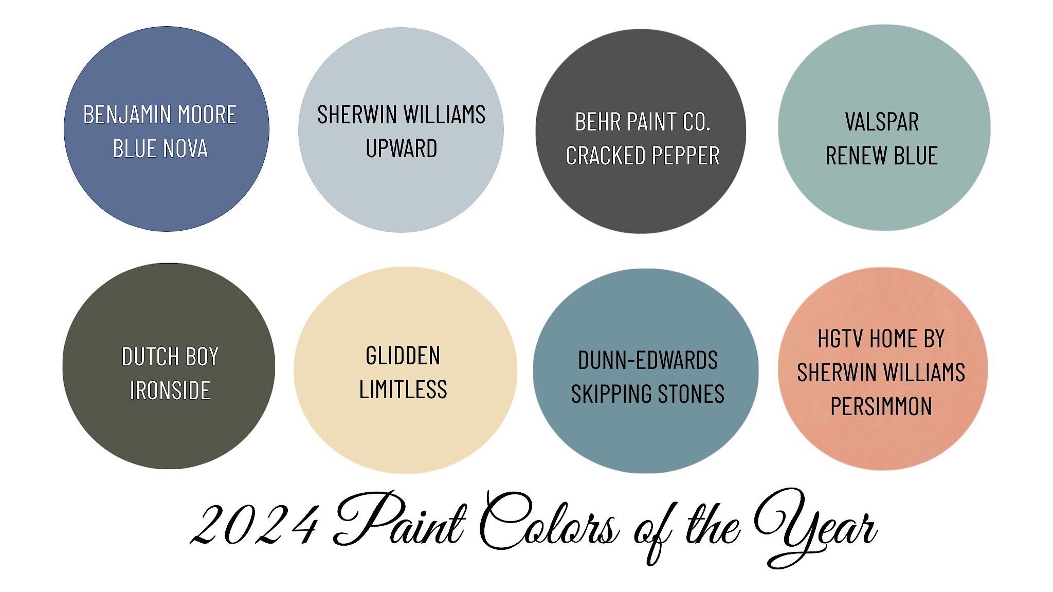
Color forecasters are predicting palettes chosen for their distinct presence and personality. 2024 is predicted to be a year of coastal-inspired blues and calming neutrals contrasted with moodier hues, such as olive green and black. This year’s trend cycle is a stark contrast from 2023’s saturated yet playful color palette.
If you are ready to give your walls a fresh update, take a look at what paint manufacturer experts believe will be big next year.
Here’s some color inspiration.
Sherwin Williams
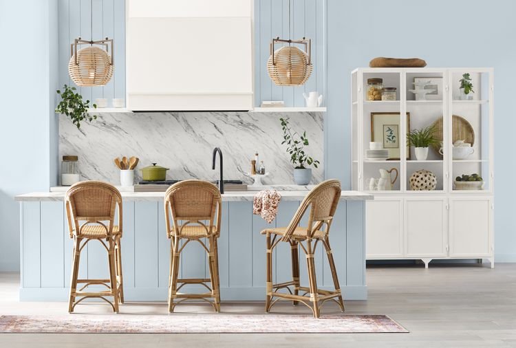
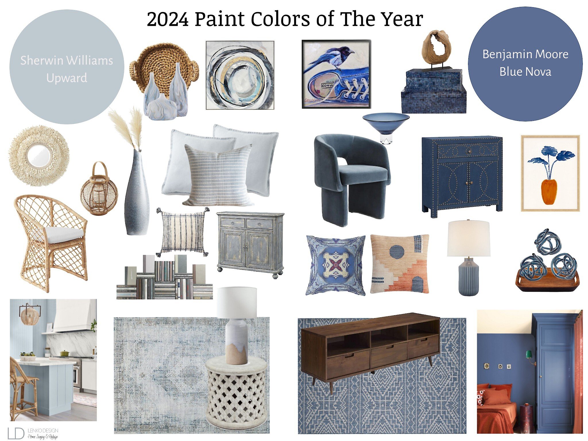
Sherwin Williams announced their color for 2024 is Upward SW6239. A blissful blue hue inspired by coastal aesthetics.
"We knew lighter tones were going to be important in 2024 and 2025 and we wanted to forecast the shift from earthy neutrals to lighter expressions and a light blue like Upward SW 6239 told that story very well," says Sue Wadden, director of color marketing for Sherwin-Williams.
The soft hue complements a variety of design styles and looks great with antiques, modern furniture, transitional pieces, and even boho interiors.
Benjamin Moore

Blue seems to be a recurring color across the paint brands.
Benjamin Moore did not disappoint with their Color of the Year pick Blue Nova 825. “Elevate the everyday and expand horizons through juxtaposed color that is sure to inspire. With Blue Nova leading the way, depth and intrigue are balanced by an undercurrent of reassurance. This alluring mid-tone features an enchanting duality, capturing the spotlight with endlessly classic appeal” Benjamin Moore.
Feeling Blue? Every year I look forward to curating fun mood boards featuring the colors of year chosen by top paint brands Sherwin Williams and Benjamin Moore.
I personally love to design with blue!!!
I think these story boards showcase the personality and versatility of each color.
Which do you prefer?
Behr Paint
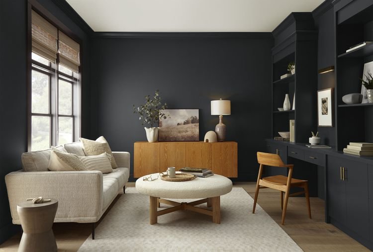
Behr Paint Company took a different approach with their color selection.
The selected a moodier, edgier color for those who are ready to embrace a color that encourages homeowners to take a leap. Cracked Pepper PPU18-1 is described as “a versatile soft black hue, acting as a neutral, creating a grounding shade that trends away from classic white-and-cream colors” - Behr Paint Company.
"The moment now is about optimism, awakening the senses, and elevating how you feel—and a room with a soft black really checks the box on all of those things," says Erika Woelfel, vice president of color and creative services at Behr Paint. Cracked Pepper works with everything from dusty pastels and metallic accents to earthy shades and bold patterns and textures.
HOT TIP: Choose your paint color LAST! Trust me on this one. If you paint first and then decorate, the paint color may not work with what you've chosen and you'll end up hating the wall color. Instead, build a color palette off of your fabrics, area rugs, or artwork.
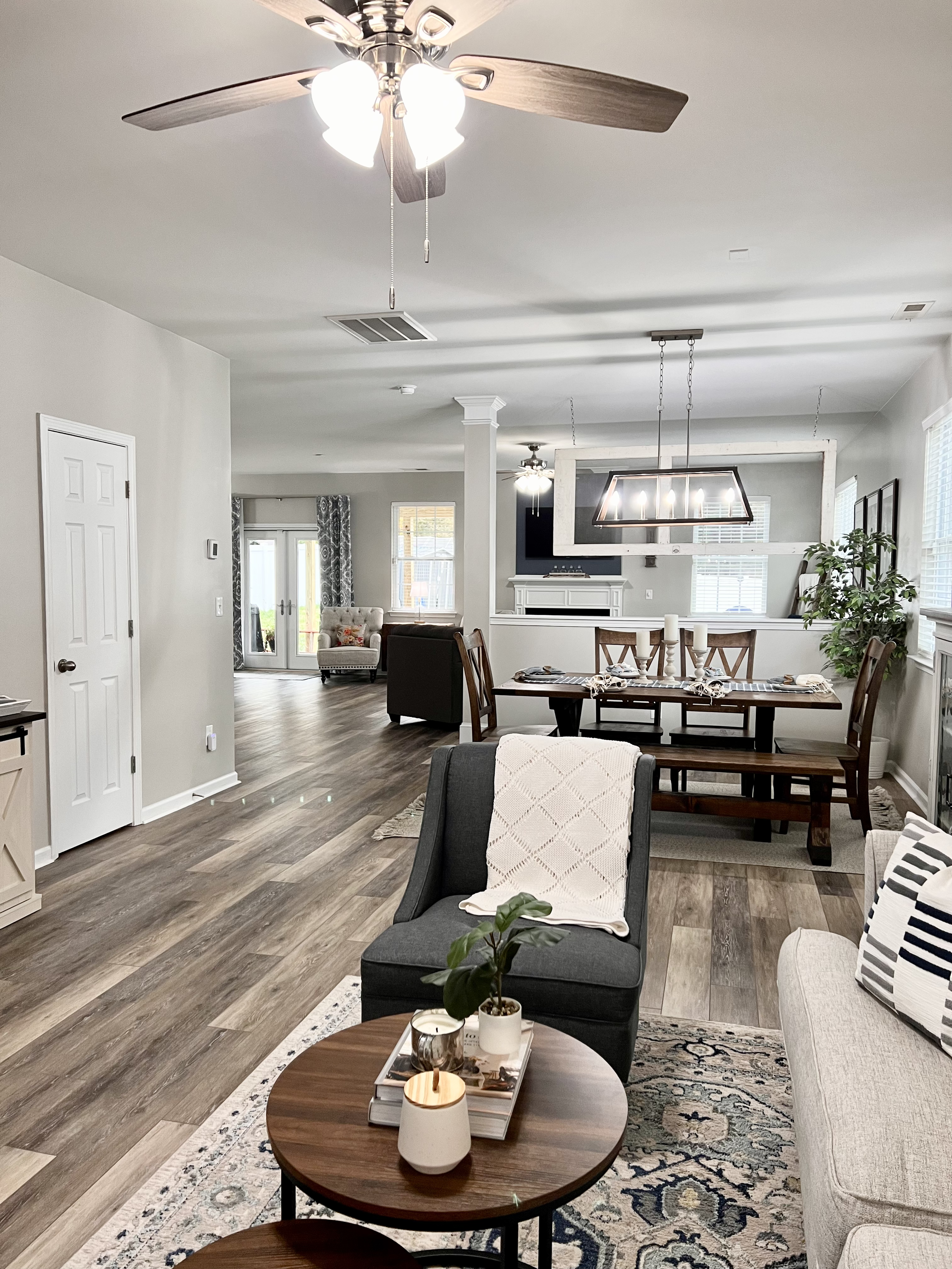
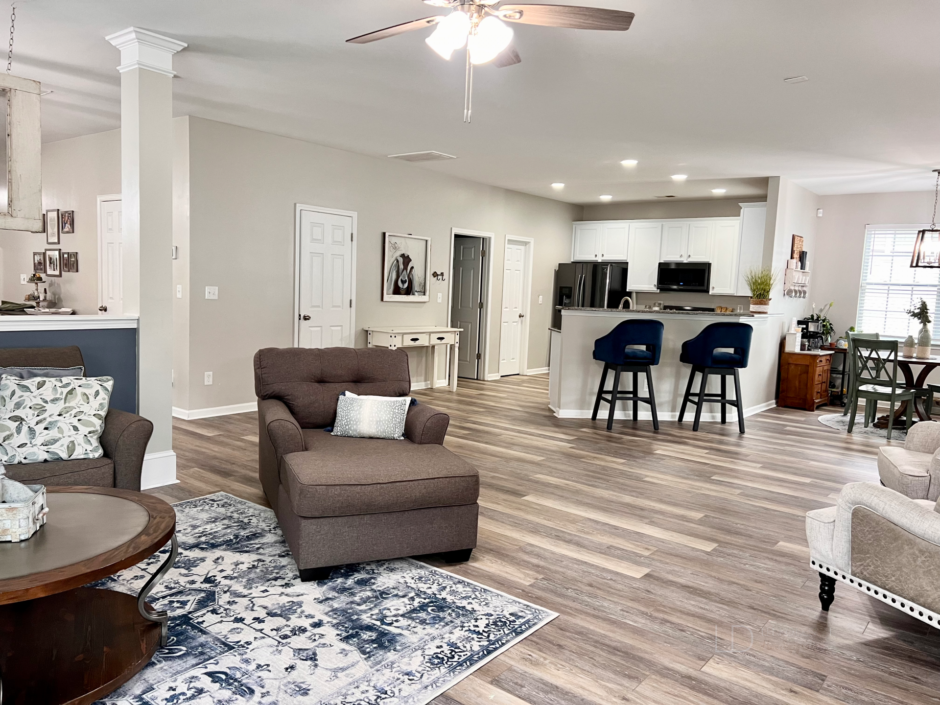
Blue is one of my favorite colors to design with. Below are some rooms in my home where I used blue!
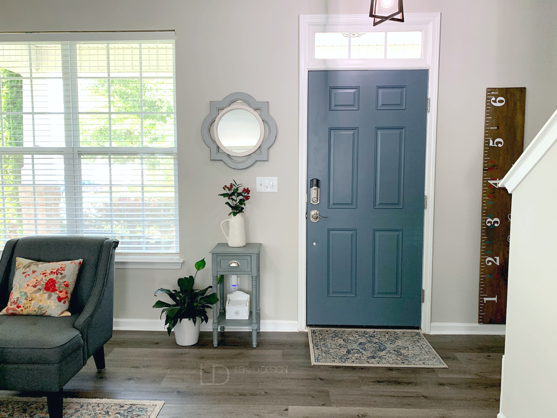
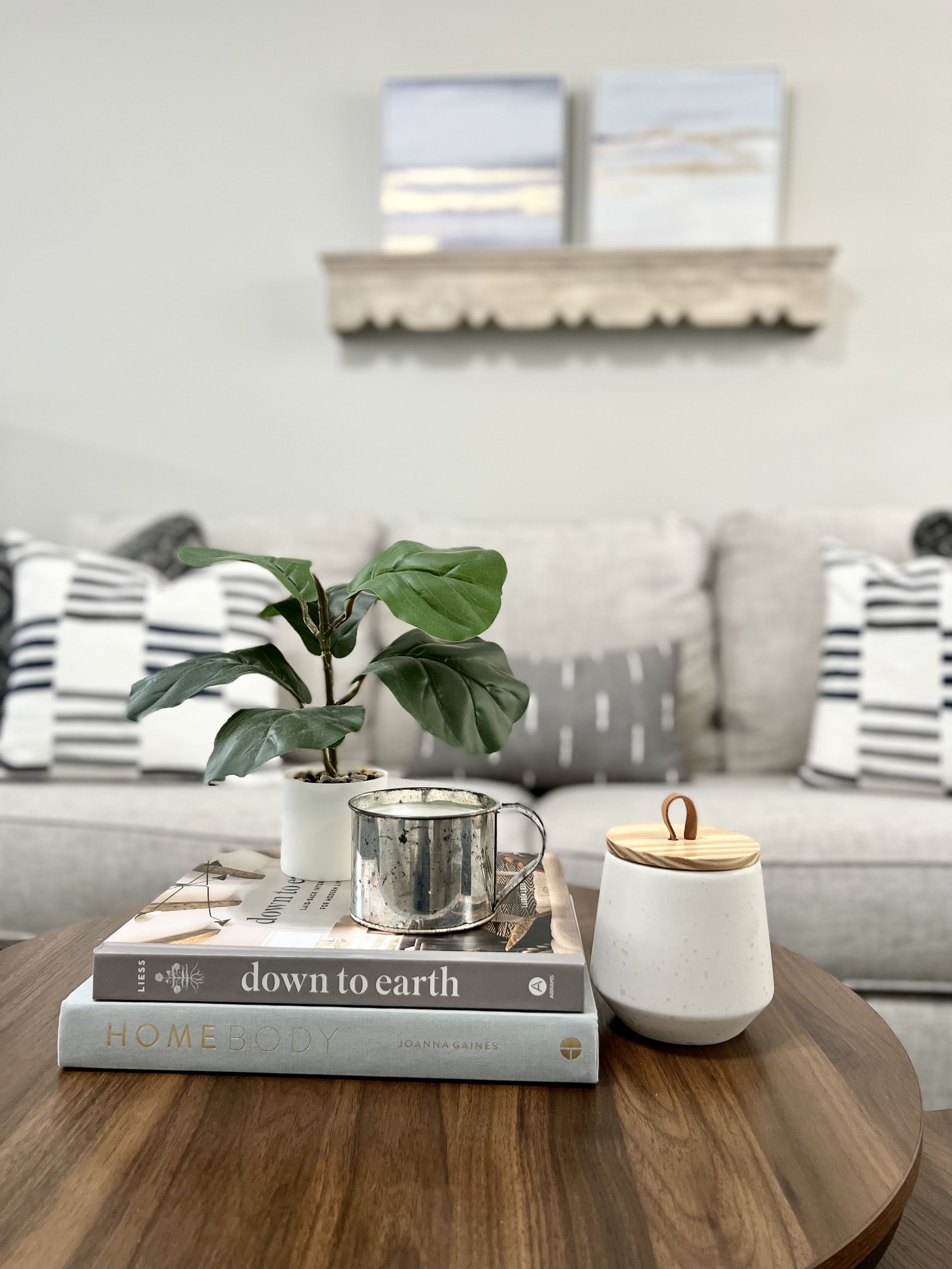
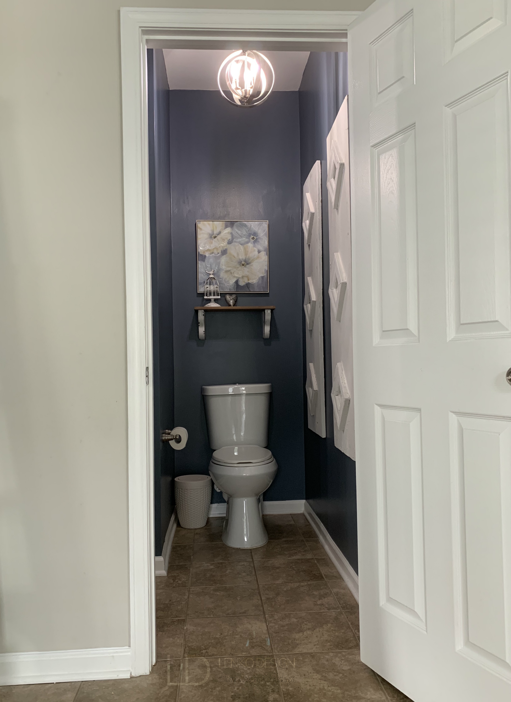
I chose to incorporate Sherwin Williams Granite Peak SW6250 throughout our first floor. The deep hue is rich and so beautiful in person. I selected this blue based on a blue and white vintage inspired area rug.
For a cohesive color palette, Granite Peak was painted on different surfaces beginning at the front door over across to the fireplace, in the Powder Room, and on the half knee wall behind a sofa.
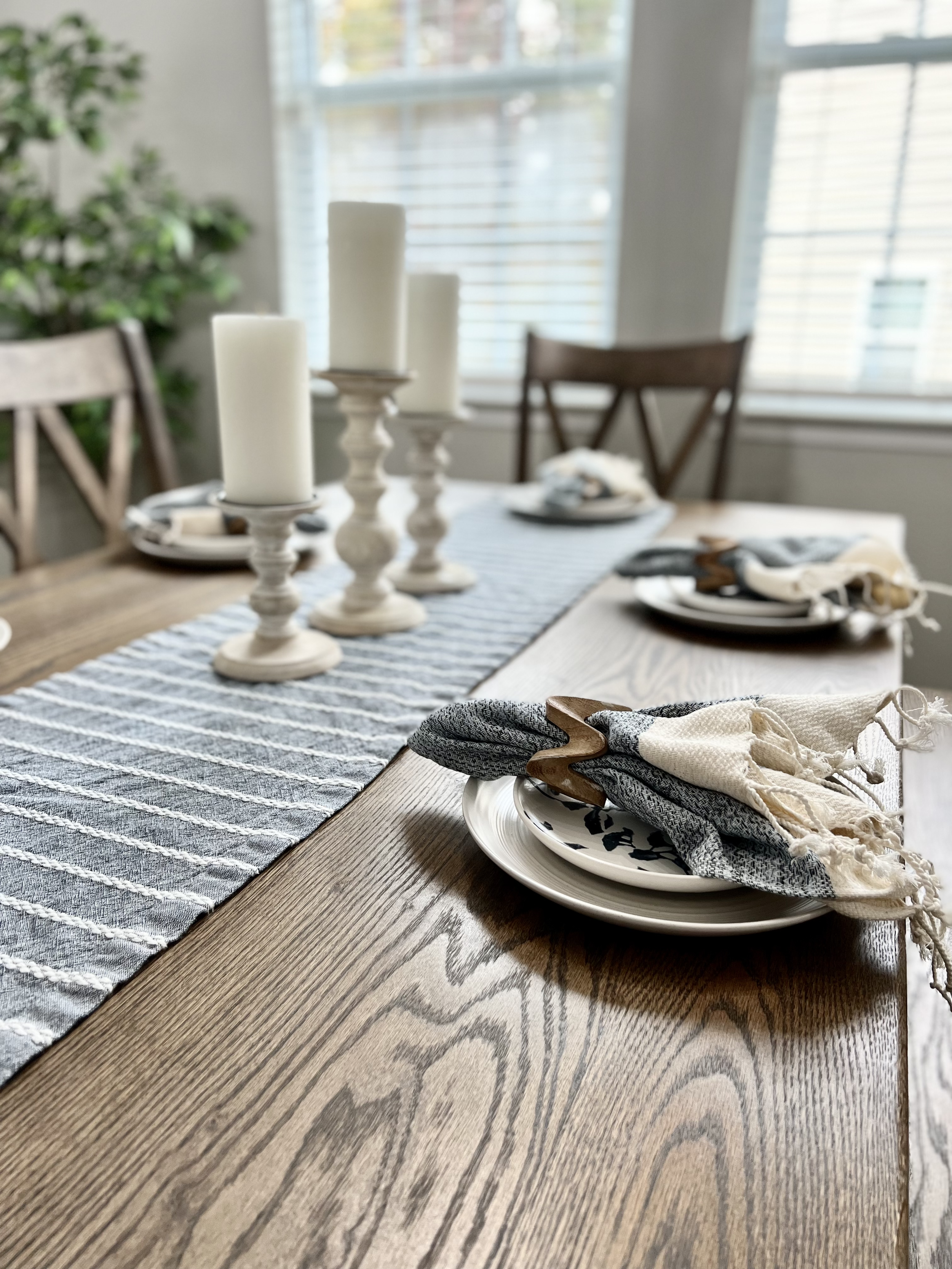
Varying shades of blue are repeated throughout and can be seen in the area rugs, wall decor, table linens, accent throw pillows, drapery fabric, artwork, and blankets.
I think my favorite room is the Powder Room because the walls are blanketed in Granite Peak. Using bold colors in powder rooms is such a fun way to incorporate your favorite color!
I guess I was ahead of the Blue Trend when I selected blue for my home! :)

Did you know that you could boost your home’s selling price by over $10,000 with a select few statistically proven paint colors?


